Accessibility review combines semantics, navigation, contrast and adaptable layout. A screenshot can expose clipping but cannot tell you the full spoken experience.
- 1Semantic labels
- 2Navigation order
- 3Adaptive layout
- 4Device review
Work through the example
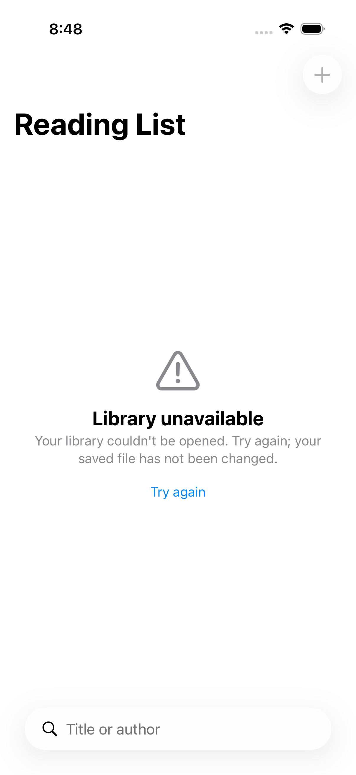
Check an empty state and an error recovery action with accessibility tooling. Keep identifiers for automation distinct from user-facing labels.
Start with a disposable branch and synthetic data. Write the expected outcome before changing the implementation, then keep the first failing result. This prevents a later repair from quietly redefining the task. The procedure below is grounded in the repository reference; its examples must still be checked against your project and installed toolchain.
Implementation reference
The following focused section is adapted from the maintained project guide. It preserves the source’s examples and limitations.
VoiceOver Labels, Hints, Values, and Traits
import SwiftUI

struct AccessibleCardView: View {
    let title: String
    let rating: Double
    let isFavorite: Bool

    var body: some View {
        VStack {
            Image("product")
                .resizable()
                .aspectRatio(contentMode: .fit)
                // Label: concise description of what the element IS (read first)
                .accessibilityLabel("Product photo of \(title)")

            Text(title)

            HStack {
                ForEach(1...5, id: \.self) { star in
                    Image(systemName: star <= Int(rating) ? "star.fill" : "star")
                }
            }
            // Combine child elements into a single accessible element
            .accessibilityElement(children: .ignore)
            .accessibilityLabel("\(Int(rating)) out of 5 stars")
            // Value: current state of a dynamic element
            .accessibilityValue("\(rating, specifier: "%.1f") rating")

            Button(action: { /* toggle favorite */ }) {
                Image(systemName: isFavorite ? "heart.fill" : "heart")
            }
            .accessibilityLabel(isFavorite ? "Remove from favorites" : "Add to favorites")
            // Hint: describes what happens when the element is activated (read after a pause)
            .accessibilityHint("Double tap to \(isFavorite ? "remove from" : "add to") favorites")
            // Traits: describe the behavior and purpose of the element
            .accessibilityAddTraits(.isButton)
            .accessibilityRemoveTraits(.isImage)
        }
    }
}
Acceptance and failure review
| Checkpoint | What to inspect | If it does not match |
|---|---|---|
| Semantic labels | Confirm the input and environment | Preserve the failure and return to this step |
| Navigation order | Inspect the intermediate artifact | Preserve the failure and return to this step |
| Adaptive layout | Run the focused check | Preserve the failure and return to this step |
| Device review | Record the observed result | Preserve the failure and return to this step |
Ask the agent to explain the smallest change that resolves the observed mismatch. Keep unrelated refactors out of the repair. A change that makes a warning disappear is not enough if the behavior or ownership contract has changed. Re-run the same acceptance check so the before and after results are comparable.
Evidence and limits
A successful UI test is not a complete VoiceOver audit.
This is an educational guide. Its presence in the series does not certify a completed client-specific lab. The series evidence record separates executed checks from exercises and blocked environments.
Inspect the source used in this lesson.
Recorded sample check
On Xcode 26.6 with an iOS 26.5 simulator, the Reading List verification script passed 3 unit tests and 2 UI tests. It exported six screenshots. This image is one of those outputs, not an AI-generated mockup. The sample uses JSON persistence and does not establish all-client app generation or a complete accessibility audit.
Related reading
- Five checks for an AI-built SwiftUI app
Use persistence, search and accessible states to make “it works” a testable claim.
- SwiftUI: review state transitions before polishing the screen
Make loading, empty, success and error states part of the implementation brief.
What to do next
Next: Performance: hangs, launch time and the patterns agents introduce